Social addictions.
Nothing gets our inspiration flowing like a good, juicy blog post. Read about what we’ve been working on (our latest launches), what we can’t stop thinking about (design trends, industry happenings and new partnerships) and what we think you should know (expert branding insights and probably some stuff about dogs).
Check back often—we’re quite chatty when we want to be.
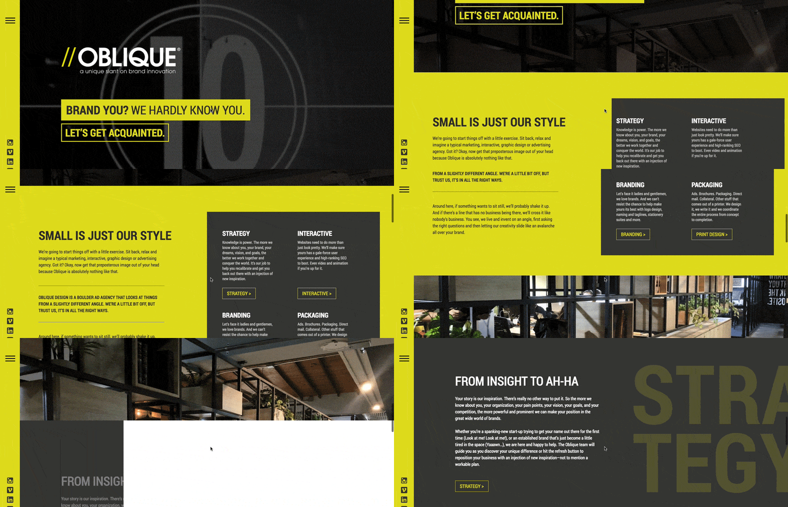
Oblique Website Version 2.0 Has Arrived!
If 2020 has taught the world anything, it is that change is constant and innovation is continuous. You have to keep your brand fresh and current.
About four years ago or so, we launched our current site and since then, Oblique has changed quite a bit. If you really think about all that’s happened in the brand world, 2015 was a long time ago. Since then, we’ve transferred to a remote-friendly working model, our team has transformed, we offer slightly different services, and we have collected a bunch of amazing new clients. Our website needed a slight update to reflect our changes.

With that in mind, we did what we do best for our clients and applied it to ourselves. We put our SLNT Method into action and did a complete website overhaul. SLNT stands for Strategize, Leverage, Narrate, and Target.
Influenced by the latest web design trends, we’ve streamlined our UI/UX, added a new hamburger menu (it’s big and bold) and inserted a few more CTA’s to help our potential clients really navigate our site smoothly and get in touch with us easily. From a design perspective, we’ve inserted subtle microinteractions throughout the typography and iconography to make our designs pop and also capture our visitors’ attention. You’ll also notice our copy has transformed: personalization of our team bios, catchy quotes, headlines and subtitles for each section, and subtle SEO tweaks to really bring it all to the next tier.
Furthermore, with any good facelift, you’ll see remnants of the past: i.e. the things that make us “us” no matter what. We’re the same Oblique with the same mission to bring you a new slant on brand innovation. You’ll still recognize our strong visuals and videos that never get old. You’ll also notice our blog section and client portfolio still remain, and in fact, they’ve grown substantially over the past four years. We’ve kept the same core brand identity and visual identity and worked within those parameters for our website redesign. For us, this rebrand was about refurbishing our UI/UX to keep us up-to-date with 2020’s technology web demands and further expressing who we are in a current way. Check out our new site, we’ve leveled up and we are so proud.
