Social addictions.
Nothing gets our inspiration flowing like a good, juicy blog post. Read about what we’ve been working on (our latest launches), what we can’t stop thinking about (design trends, industry happenings and new partnerships) and what we think you should know (expert branding insights and probably some stuff about dogs).
Check back often—we’re quite chatty when we want to be.
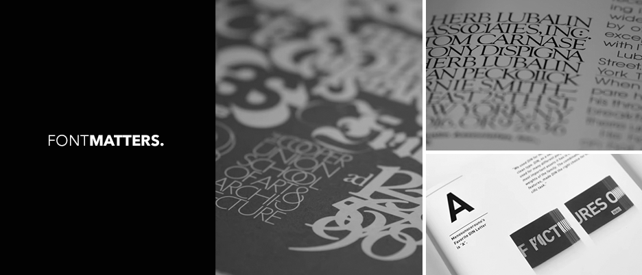
Font Matters
A lot of psychology goes into the concepts behind brand logo designs. A successful brand mark conveys a multitude of information to your audience in seconds. It tells them who you are, what you do and why you’re different from the others in your industry. While a strong concept is the foundation of great brand and logo design, every detail in the execution is crucial to success. Everything from typography, color, shape and space are taken into account to instantly communicate the overall look and feel of your brand.. Did we say typography?! Yes, the font you use matters.
Typography utilizes these design elements to evoke emotions and convey identity. The audience can know just what you’re about based on the typography used. The inclusion or exclusion of serifs, weight of the font, contrast and geometry all lend to create meaning behind the letter forms. Let’s take a look at some well known logos and dissect the designers choice in typography.
Giorgio Armani
This logo for Giorgio Armani is the quintessential fashion logo and it would be difficult to mistake it for anything else. This is done (in part) through the typographic choices made. The designer used Didot, a modern typeface characterized by thick to thin contrast in stroke weight, short serifs and circular lines. These elements have become synonymous with luxury and status.
![]()
Nike
Perhaps one of the most recognizable brands in the world, Nike has reached the status where only their swoosh symbol is needed to recognize the brand but that doesn’t mean the typography was not carefully chosen. Futura is used in this logo, a geometric sans-serif typeface. Its equal proportions make Futura synonymous with clean and modern. The weight of the font and spacing between letter used here creates a feeling of boldness and the oblique slope of the letter forms gives the feeling of forward motion, a nod to Nikes athletic products.
![]()
Tommy Hilfiger
Fashion brand Tommy Hilfiger uses Gill Sans for the typography in their logo. Gill Sans is a humanist sans-serif typeface. The proportions, absence of serifs and letter spacing lend to an innovative and stylish look while the humanist qualities derived from handwriting give the brand an approachable people centered quality.
![]()
American Apparel
What would a look into typography be without an example of one of the most famous typefaces, Helvetica. It’s association with swiss design style makes it the go to font for the modern feel. It’s basic, simplistic, and utilitarian while being approachable. This style reflects the trendy, fashion basics that American Apparel offers. How else are you going to justify spending $20 on a blank T-shirt?

In designing logos, every detail is important to convey your identity to the audience and typography can make or break your brand mark. Check out our branding work and drop us a line if you’re looking to enhance your brand presence.