Social addictions.
Nothing gets our inspiration flowing like a good, juicy blog post. Read about what we’ve been working on (our latest launches), what we can’t stop thinking about (design trends, industry happenings and new partnerships) and what we think you should know (expert branding insights and probably some stuff about dogs).
Check back often—we’re quite chatty when we want to be.
Hidden Symbolism in Logo Design
I’m sure at this point most people are familiar with the arrow hidden between the “E” and the “X” in the FedEx logo. In fact, a lot of the most famous and recognizable logo designs have some sort of hidden symbolism embedded in them. Symbolism is an important part of creating a logo concept. Whether it’s direct or indirect, incorporating symbols can communicate your brand to customers in an instant. Here’s a few examples of some of our favorite famous logo designs and the hidden symbolism behind the concept.
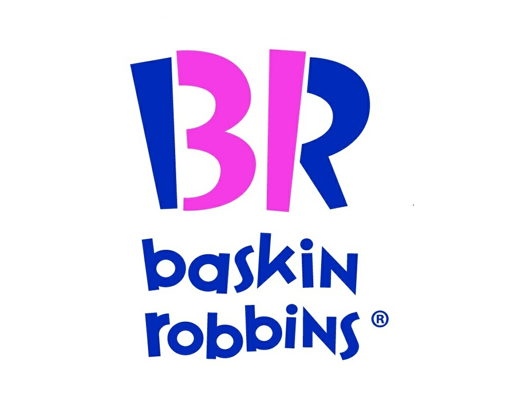
Baskin-Robbins
One of the most recognizable ice cream chains, Baskin-Robbins’ brand is fun and energetic like the experience of going into their store and having 31 different ice cream flavors to choose from. Through the use of color and typographic choices, their logo successfully encapsulates everything the company is about. In addition, the “BR” contains a “31” slightly hidden within the pink portions of the letterforms that reference their 31 different flavors, a cornerstone of what makes the company stand apart from its competition.
Tostitios
Another brand that represents fun is Tostitos. Their brand is meant to be enjoyed in social settings with friends and family. Aside from the colors and the playful typography, there is hidden symbolism within their logo. If you look closely, the two “T’s” form the shapes of two people holding a chip, while the dot on the “i” creates a bowl of salsa.
![]()
Toyota
One of the most recognizable automobile brands, Toyota’s logo has a ton of symbolism embedded in it. Unlike the previous two, Toyota’s logo design takes a more abstract approach. For starters, each letter in the word Toyota is present within the brandmark. On a more abstract emotional level, the overlapping ovals symbolize unification and connection and the negative space represents Toyota’s technical innovations.
![]()
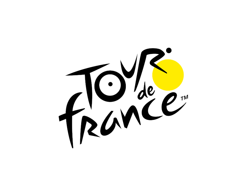
Tour de France
This logo for the Tour de France has a cyclist embedded in it. If you look closely, the shapes of the “O”, “U” and “R” combined with the yellow circle make the shape of a cyclist on a bicycle. In our opinion, this is beyond clever.
Hyundai
At first glance the Hyundai logo appears to just be a little “H”. Upon closer examination the letterform also doubles as an abstract representation of two people shaking hands; A client and company representative showing customer trust and loyalty.
![]()
Levi’s
Levi’s is a long established and well recognized brand. For their iconic emblem logo design, the recognizable shape at the bottom represents the stitching pattern found on the pockets of all of their jeans.
![]()
At Oblique, we love going deep and thinking conceptually. Can you spot the hidden meaning in some of our logo designs?
If your brand has a great story to tell we’d love to help you tell it! Check out our branding work and drop us a line!