Social addictions.
Nothing gets our inspiration flowing like a good, juicy blog post. Read about what we’ve been working on (our latest launches), what we can’t stop thinking about (design trends, industry happenings and new partnerships) and what we think you should know (expert branding insights and probably some stuff about dogs).
Check back often—we’re quite chatty when we want to be.
Catch Their Eye: Color Trends of 2018
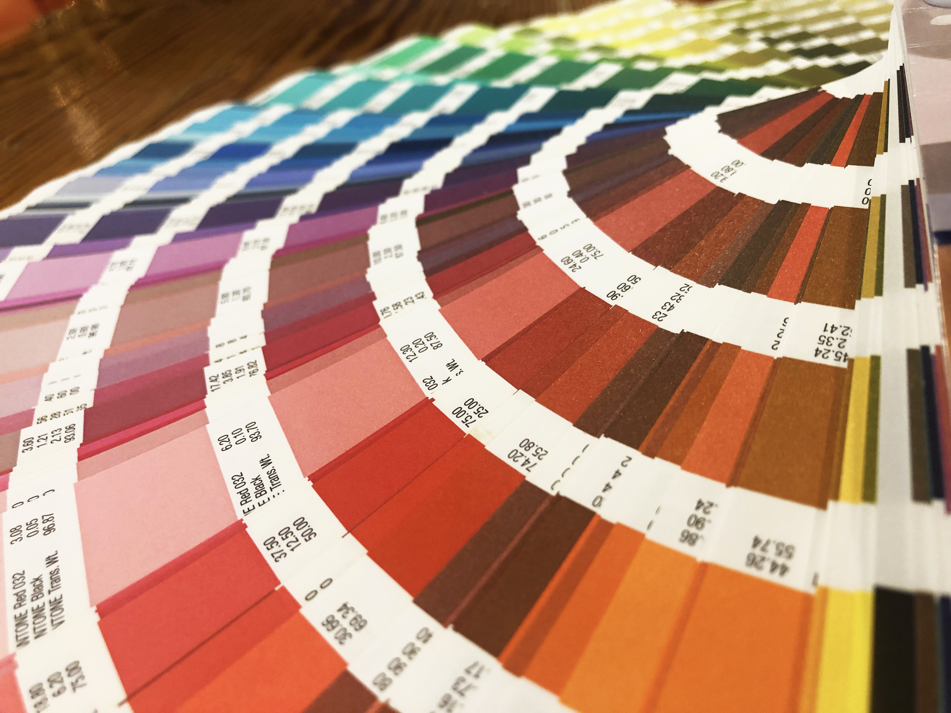
Color. It assaults our eye wherever we go. It evokes emotion within us, it makes us ask questions, and it draws us in. Color can strip us of our defenses and make us want something we previously decided we didn’t need. And here’s where it’s important to pay attention: Color can be ammunition for businesses, taking consumers prisoner and demanding that they pay attention to the services and products being offered. If businesses want to make sure they have to best weapons in their arsenal, they must pay attention to the current trends, the aesthetic components that consumers are craving. Sound a bit intimidating? Don’t worry! We have you covered with this on-trend color guide that will have consumers eating out of the palm of your hand.
Pink
Yeah, pink conjures up images of little girls playing princesses and that uber fashionable toy that never goes out of style, Barbie. But you know what else pink conjures up? Power. Versatility. On-trend. Pink is popular right now and we better get used to it because it is here to stay. It is breaking gender barriers making itself known as the power color of the millennium. Pink can be used as a statement color with bright, bold hues, like this logo or used as a neutral in soft, muted pastels.
Bright, Bold Color Palettes
Another trend we are seeing this year is bright and bold colors and it’s no wonder why. Eye-popping color has always been a surefire way to get an ad or logo noticed and this trend is letting us know that it’s okay to stick with what we know. While it’s important to consider how well colors play with each other to create an image that’s pleasing to the eye, the sky is the limit with this trend. You can choose to make use of many bright colors to make a statement such as in this logo or you can let just two colors in bold shades do the work on drawing the consumer in, like with this packaging.
Metallic Accents
Metallic colors are a powerhouse in the visual arts and fashion industries and they are proving to be just as strong in the advertising world. They are becoming even more popular as they are now classified as neutrals, but a little goes a long way with adding sophistication and elegance to any brand or logo. This brand is an example of how a metallic tone can take a simple design and make it luxury.
Whether you prefer to go bold with bright, neon colors and intense hues, evoke a feeling of luxury and class with metallics or explore the spectrum of pink shades available, you are guaranteed to pull in the consumers you are looking for when you employ these trends. Not sure what direction your brand should go in? Contact us to get a recommendation. We take the time to get to know you and design a brand based on your company’s unique personality!