Social addictions.
Nothing gets our inspiration flowing like a good, juicy blog post. Read about what we’ve been working on (our latest launches), what we can’t stop thinking about (design trends, industry happenings and new partnerships) and what we think you should know (expert branding insights and probably some stuff about dogs).
Check back often—we’re quite chatty when we want to be.
Several Design Reminders Inspired by Chip Kidd
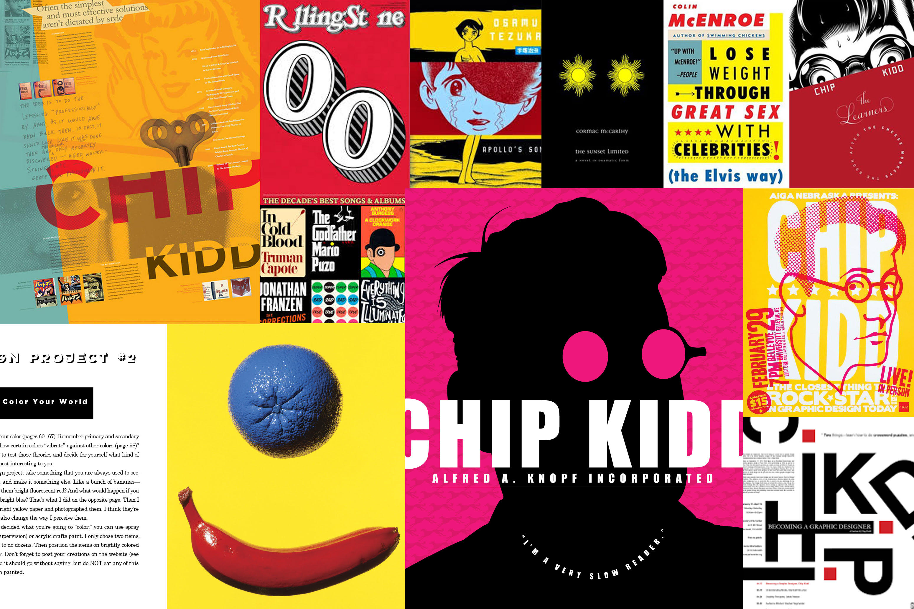
As graphic designers and brand specialists, we’re always looking for inspiration that will strengthen our creative chops. Recently, we’ve been exchanging insights shared by Chip Kidd, power-house New York based book jacket designer and winner of the Cooper-Hewitt National Design Award. Here are a few reminders from a recent article and how we put them into effect across our own branding, interactive and packaging projects.
1. Don’t Be Too Obvious
When working with a new client, we first sit down and get to know all about their business. We dive deep at first and then later sift through the details to determine what specifically should be our focus, and theirs. When crafting a new brand, concepting for a new ad or designing a packaging, we strive to convey what’s important without being too in-your-face obvious. We constantly ask ourselves “how can we convey this in a new and unexpected way?”
2. Narrow Things Down
Before we start designing, it’s important for us to understand the parameters and limitations of each project. While too many stipulations can stifle creativity, too much freedom can lead to a lack of direction and focus. The same principle can apply to design concepts. Oftentimes when presenting initial concepts we’ll limit the number of fonts or colors we show so our client can focus on the overall concepts and zero in on the idea they like best. Fonts and colors and other details can be determined once we’ve decided on an overall direction.
3. Be Candid and Clear
When conveying a concept through design, you can be very literal or very creative; highly straightforward or highly abstract. Is it best for a viewer to know exactly what you do within seconds of seeing your ad or can we create a sense of intrigue that gives the viewer just enough information so they’ll want to seek more? We leave it to our clients to ultimately decide where their brand falls along this spectrum, but we do believe the best designs strike the perfect balance of each.
4. Keep It Simple
It can be easy to overdo it and over-complicate a design. You see examples of this all the time where someone has tried to incorporate too many design elements and ends up creating something that is overly busy, overwhelming or just visually off. The best designs find the right balance of visual elements and minimalism to create something that is unique, interesting and visually appealing. While designing we regularly take a step back and ask ourselves “is this too much”?
To see all eight tips offered up by Chip Kidd, you can find the original article here: http://www.howdesign.com/design-creativity/designer-spotlight/book-design-tips-chip-kidd/