Social addictions.
Nothing gets our inspiration flowing like a good, juicy blog post. Read about what we’ve been working on (our latest launches), what we can’t stop thinking about (design trends, industry happenings and new partnerships) and what we think you should know (expert branding insights and probably some stuff about dogs).
Check back often—we’re quite chatty when we want to be.
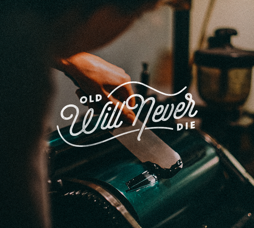
Design & Branding Trends: Old School Will Never Die

Styles may come and go, but some old school talents last forever. Anything and everything vintage will always be recognized and appreciated, if they are classic. Retro trends in the design and advertising world such as the letterpress, have influenced far more generations than most people expected it to. Some critics have looked down on it as a “dying trade” but that’s also what makes it so effective today: rarity. Things from the past will always have an impact on the future. There is something in the handcrafted elements of objects–like a screen print–that make them badass. That artist put their heart and soul into the method to create something truly original.
There are lots of different opinions on modern branding and what is the top design priority of today, but everyone can seem to agree on the power of vintage. Hand lettering is a great example, and is one of the most underrated techniques that a designer can possess. When we talk about raw talent and skill…it’s a killer trade to have under your belt. There will always be a need for the old school abilities, even if they play their role in the early stages of design. Both clients and peers will appreciate a hand-drawn authentic way of doing things versus the newest, cheapest way. The art of badges, icons, patches, and all that jazz have been around and will always be around because of the tribute that each of them pays to the craft of design. The retro element of surprise will continue to apply to the world we live in. I’m sure everyone has passed by something old or vintage and stopped to say, “that’s pretty sweet, check that out.” The constant wonder and appreciation for the past is what pushes designers to collect and create the print, logo or font.
Knowing both the old and new ways of doing things is a great advantage when it comes to design. Having the background and appreciation for the “lost” arts can give you that edge over competition. Here at Oblique Design, we have that edge. In the world of advertising agencies, we seamlessly integrate the old with the new and have that passion for vintage concepts as well as expertise in new ones. The combination of these two design aesthetics is what separates us from other agencies, and allows us to thrive regardless of the project. It’s important not to overdo it or become mechanical, but to use it for purpose. Handcraft Kitchen and Cocktails is a great example of a restaurant project where we were able to successfully balance old school craft and modern branding techniques to help them launch their new look. Growing in this trendy design world, the old can sometimes be left behind, but hopefully it will never be forgotten. At least not as long as many of us stay true to the legacy that’s helped us get how far we’ve come.
