Social addictions.
Nothing gets our inspiration flowing like a good, juicy blog post. Read about what we’ve been working on (our latest launches), what we can’t stop thinking about (design trends, industry happenings and new partnerships) and what we think you should know (expert branding insights and probably some stuff about dogs).
Check back often—we’re quite chatty when we want to be.
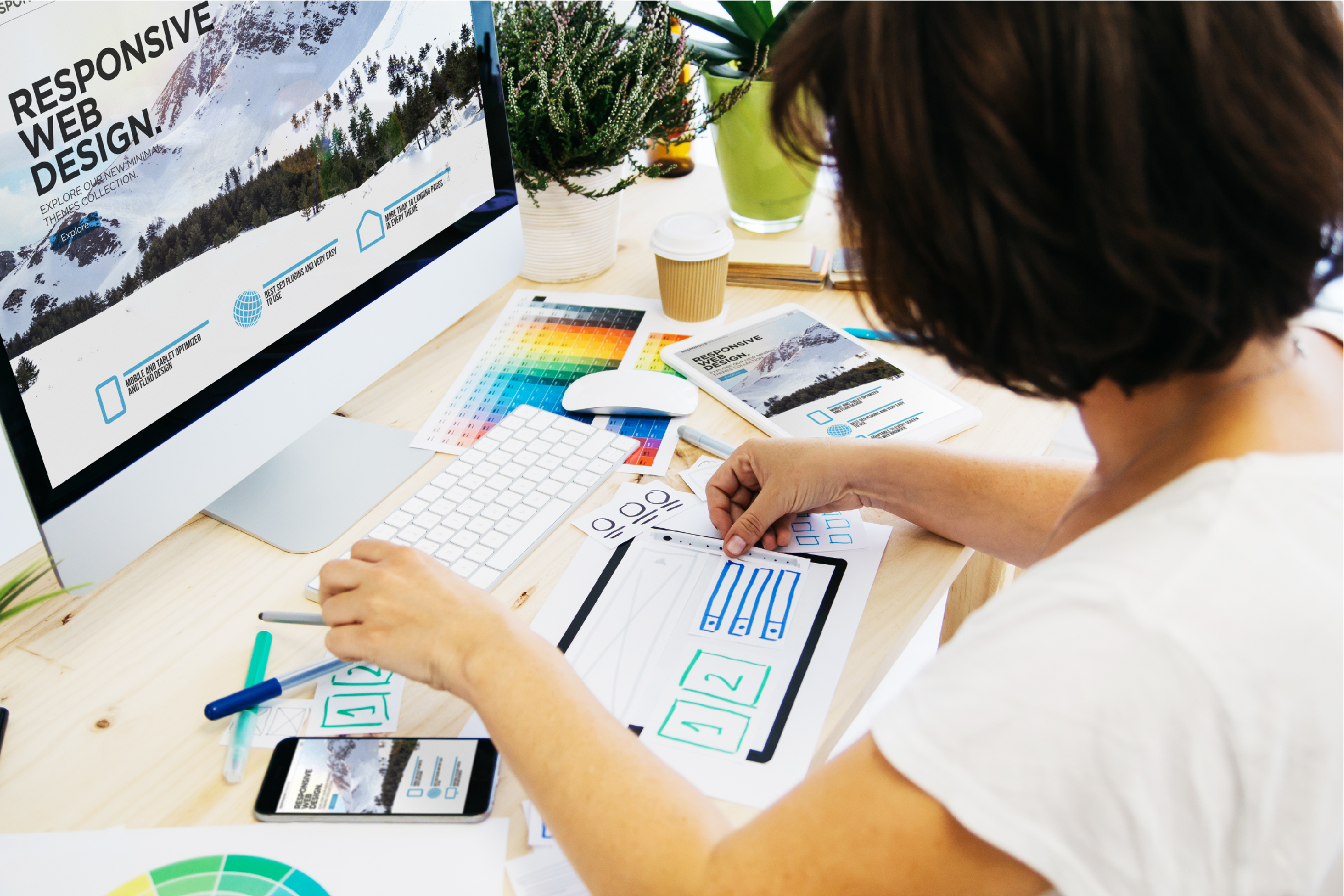
10 Web Design Trends We’re Already Over
Things are getting visually repetitive on the internet these days. Some could say, the internet is in the midst of a design dry spell. So, we’d love to help you set yourself apart from the masses! We’re going to give you a shortcut to help narrow down web design choices and give you a list of 10 design trends to avoid:
- Vintage: Rough overlays, busy scripts & typefaces, muted color palettes, sepia, and highly textured backgrounds.While none of these stylistic elements are intrinsically bad on their own, the minute you put all of them together, they become a roadblock for the reader. We don’t have long attention spans, so if it takes longer than 1 second for a reader to decipher anything on the webpage, you’ve already lost them.
- Coming Soon Pages: A webpage announcing that the full website or app is literally coming soon.Do you really expect your users to be sitting at their computers or on their phones for days waiting for the full site to appear? Would you do that? No one has the patience of 1000 Buddhist monks combined.
- Super-Thin Typography: Really skinny text.Due to backlighting or screen size or lack of contrast, thin typography is pretty difficult to read. Make sure your fonts have weight and appropriate thickness so you can communicate more effectively.
- Obvious Social Media Feeds: By this we are talking about the widget that provides constant live feeds of your social media accounts.By design, Twitter, Facebook, and Instagram are best viewed and interacted with in their native format. Having live feeds of your accounts does not contribute to the user experience of your site. Generally, social media accounts are used to drive traffic to websites, and by duplicating the very feed that directed incoming traffic to you, you’re just presenting redundant information that is taking up valuable design space on your website.
- Hero Image Sliders: These are those big image slide shows that you have to click through.Research by the Nielsen Norman Group shows that people don’t click through Hero Image Sliders. In fact, these sliders make it more difficult to distill important information as it becomes hidden in the heart of your site.
Furthermore, auto-playing slides are difficult for communicating to your users as well because you never know where they will land and what information the user will get from them. Simplify your user’s life and stick to one really interesting graphic, animation, or image.
We can think of one exception to this rule. Hero Image Sliders can, in fact, uniquely make sense in a portfolio based website, where there is more of an emphasis in showcasing bodies of work as opposed to communicating specific information. In this specific case, auto-scrolling works as well.
- Heavy Video: i.e. High resolution, longer, cinematic videos with sounds.Full-screen movie style is cool and all, but many users digest web content in short bursts of energy and have no patience for waiting.High-resolution viewing is great for users with high-speed internet and large screens, but truth be told, most people look at the Internet via their tiny phone screens. Moreover, people’s phones are mostly on mute, so you can’t count on videos with sound having the effect that you want.
- Page Loading Animations: In olden days, (re: a decade ago) page loading animations were used to hide heavy, slow-loading websites.This might have been cute 10 years ago, but we’re out of the Internet Dark Ages and can’t be fooled. You should have a light enough design where there is no loading delay.
- Icon Overload: When a web design has too many redundant icons.Look, a great set of icons can be visually appealing and useful. However, they need to be commonly understood visual cues that serve a purpose. There have been trends that showed websites using oversized large icons to make up for the holes poor images or video cues left.
- Mega Menus: Menus with an overwhelming amount of options; menus that scroll; menus that take more than .5 seconds to read.Mega menus may seemingly consolidate all the different webpages your site contains; however, sifting through hordes of information is exhausting and increases your webpages bounce rate. Furthermore, if your site is that content rich and you have enough pages that necessitates a scrolling menu, perhaps you may need reevaluate your UX, figure out a more efficient organization and streamline 3-5 options.
- Ghost Buttons: These are the buttons hidden in text.
They are used for a minimalist design aesthetic, but in order to find them, you have to hover your mouse along the web page and realizethat there is a button to click you through to the next page.While these buttons may have once looked sleek, they were not functional. If your user has to spend time searching for the contact or check-out button that should be staring them in the face, you’re doing something wrong.
This list of 10 trends we have provided is not to say that these visual facets are completely wrong. We’re just giving a different vantage point on web design that may have forgone functionality for ambiance. Incorporating small elements of these aesthetics is okay. However, remember that while design is important, user experience and interface should be at the top of your priority list.