Social addictions.
Nothing gets our inspiration flowing like a good, juicy blog post. Read about what we’ve been working on (our latest launches), what we can’t stop thinking about (design trends, industry happenings and new partnerships) and what we think you should know (expert branding insights and probably some stuff about dogs).
Check back often—we’re quite chatty when we want to be.
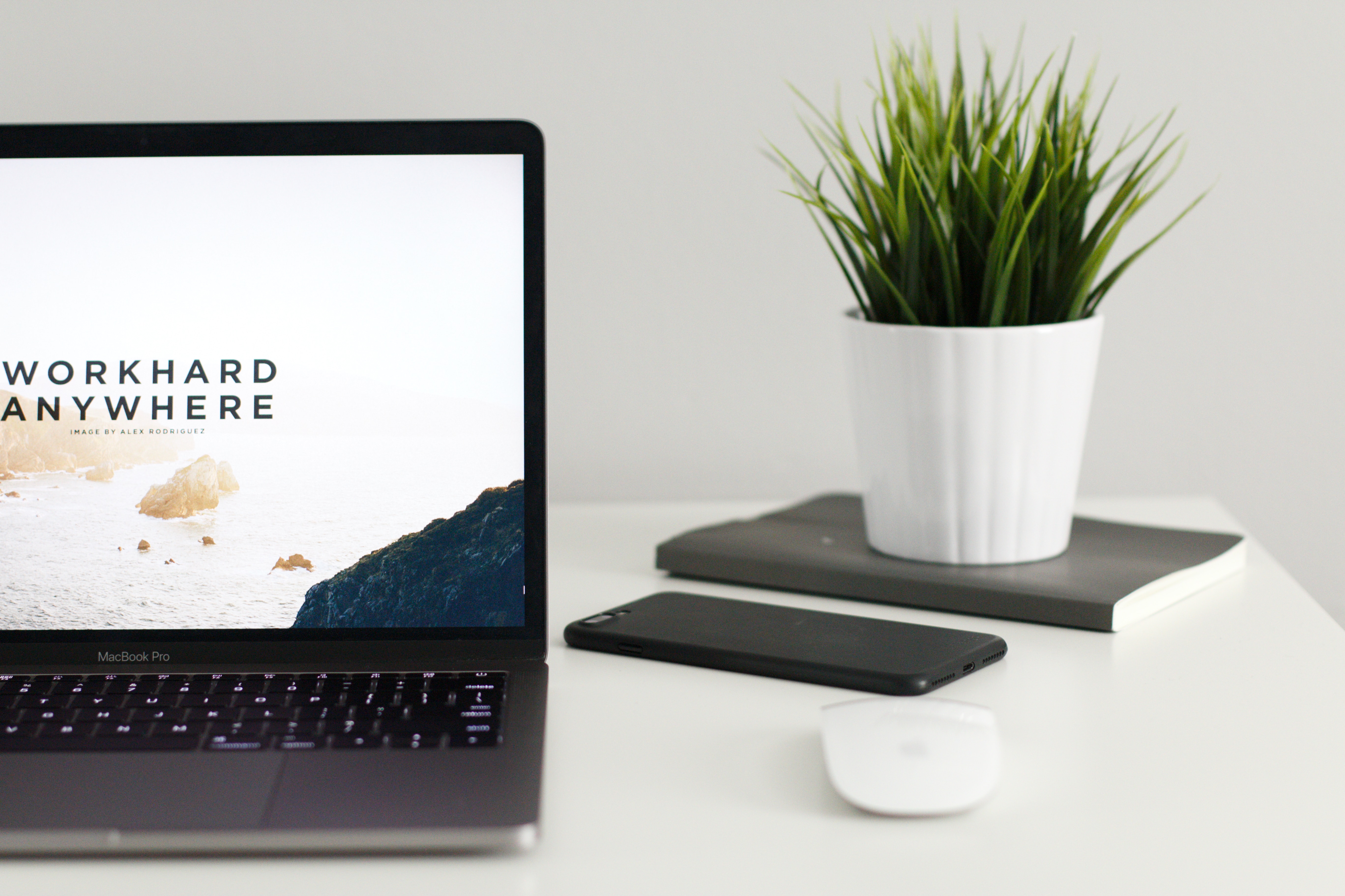
10 Tips for Minimalist Design
Minimalism is having its moment right now. Just like Marie Kondo shaped our closets, we’re going to help you with your website redesign (i.e. your proverbial work closet).
Here are 10 Tips to keep in mind when trying to create the best Minimalist Design possible.
1. Simplicity:
Choose a sleek font and a limited color palette. Select a key element to serve as the visual and see how you can manipulate your graphic design to focus on it. Then, create messaging that matches the visual theme.
2. Typography:
Choose 1 or 2 font families. Create a hierarchy for how to use these type elements in ways to highlight key words, phrases or messaging.
Pro tip: if you question your font, rethink it. It should be straightforward.
3. Streamlined Color Palette:
Typically, a minimalist color palette is black & white and a neutral tone, plus one other color to drive the design. This color can be used as anything from the background of the webpage to an accent, but it has to be constant in its role.
4. Consistent UX Design:
As a general principle, user experience designers should always create web design that users easily understand without thinking about it. Furthermore, in regards to minimalist design, engagements should be direct, simple and purposeful.
5. Color:
We’re reiterating the importance of color in regards to minimalist design, because too often we see simply black & white webpages. It doesn’t have to be like that! We’ve seen beautifully colored minimalist design that features a carefully curated, simple color palette applied to drive messaging and key visual elements.
6. No extras:
After you’ve finished your first web design draft, review each individual element and ask yourself: “Does this serve a purpose or is it pure decoration?”
If your answer is “it is pure decoration,” get rid of it.
7. Bold white space:
Don’t shy away from white space. You need it so that each element and concept is clearly discernable. You can make each line pop with ample spacing so that each and every word counts.
8. Open Space:
Here’s another case of us doubling up on our list, but look, you have to understand how important open spacing is in minimalist design. Open spaces can be used to direct your attention and balance out heavier parts of your design. By carefully avoiding symmetrical flow and repetitive patterns of linespacing, you can use open space to create depth in your design without adding frivolity and keep your minimalist template intact.
9. Balance:
While repetitive symmetry and uninspired design is a big “no-no,” balancing your heavy design elements with lighter ones to create harmony is a big “yes-yes.” Minimalist design can be text heavy at times, and there need to be other design elements to counter balance that weight.
10. Imagery:
Images are not to be shied away from. They can bolster support for light design elements and creatively fill your open spaces in a way that does not weigh your page down. As long as the image used is simple and easy going with no cluttered scenes or tight, distracting cropping, it is a viable option to add to your design.
There are common misconceptions that minimalism is too bare and empty, or that it is repetitive and the easy way out. But there’s so much more that goes into it. Some of these trends that we see in minimalism have a minimal feel with maximal elements, and it works. There’s intricate planning involved in the design process, but the result reflects a carefully curated, harmonious webpage with its customers’ best user experiences in mind.
If you’re looking to hop on board and design the perfect minimalist website, we’ve got you. Contact Oblique Design ASAP.