Social addictions.
Nothing gets our inspiration flowing like a good, juicy blog post. Read about what we’ve been working on (our latest launches), what we can’t stop thinking about (design trends, industry happenings and new partnerships) and what we think you should know (expert branding insights and probably some stuff about dogs).
Check back often—we’re quite chatty when we want to be.
The Emotional Lives of Colors
As any parent of a preschool-age child can tell you, colors are a big deal. Choosing a favorite color is one of the first things little kids do when they begin to identify as individuals and differentiate themselves from others. Children, whose identities are still in flux, change favorite colors the way Beyoncé changes nail polish, but as people get older and our identities stabilize, we often settle on more permanent color preferences. Colors play an enormous role in our emotional lives—even if we don’t realize it.
While your favorite color says about as much about your personality as your shoe size (sorry Buzzfeed), according to studies in color psychology, people do respond to colors in fairly predictable ways. Designers learn to recognize these patterns, combine them with culturally accepted color meanings, and leverage them in their practice.
Like typography, coloring is both an art and a science, and its flexible rules are heavily dependent on context, feeling, and mood. Here’s how our design team at Oblique uses different colors to evoke certain perceptions and emotions when creating the perfect logo, website, or brand identity at our agency.
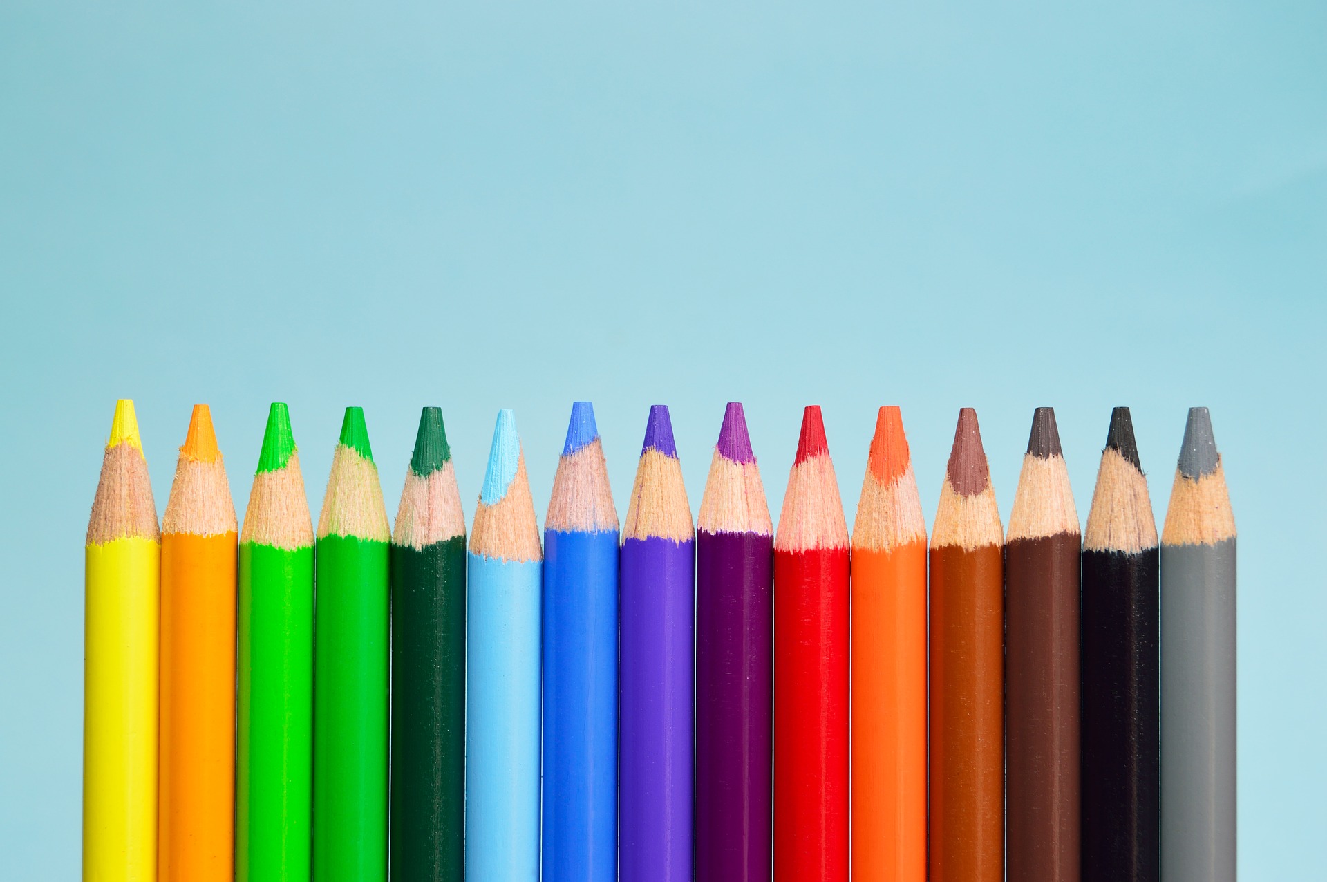
Warm Colors (Energizing)
Red
Variations: Pink, Maroon
Red is an exciting, powerful color that suggests trendiness, independence, and confidence. It’s also frequently associated with romance and passion. Too much red in a design can be overwhelming, but it makes an excellent accent color, especially for inspiring action. We use lighter tints to represent playfulness, while darker shades elicit importance and sincerity.
Orange
Variations: Peach, Vermilion
Orange may be America’s least favorite color, but here at Oblique, we love all colors equally! Orange’s vibrant hues are bold and fresh, bringing to mind a cold glass of fruit juice on a hot summer day, while more subdued shades conjure images of autumn. Since it’s made using both red and yellow, it works well as a stand-out color that doesn’t take itself too seriously, and is great for conveying friendliness and vitality.
Yellow
Variations: Cream, Goldenrod
Yellow usually elicits feelings of happiness, but an excess of the color creates anxiety (and it’s not exactly easy on the eyes). Bright yellow, when used as an accent, commands attention more cheerfully than orange or red. Pale yellows are fun and lighthearted, and dark, golden shades—like those you might find in an antique shop—can give the impression of timelessness.
Cool Colors (Calming)
Green
Variations: Lime, Olive
Green is a secondary color made by mixing blue and yellow, so lighter greens tend to take on some of the youthful energy of yellow, while darker greens and teals have a more relaxing effect. Found abundantly in the natural world, green is balanced and pleasing to the eye, as well as appetizing when used in the context of food. It represents a variety of concepts, from nature and growth to freshness and finance.
Blue
Variations: Turquoise, Indigo
Blue is widely regarded as the most popular color, and is often associated with dependability and strength. It’s the color of the sky and clean water, and we’ve used it in our designs as a refreshing, cooling hue. Light blues feel more relaxed than dark blues, whose heaviness feels sturdy and reliable. While blue is sometimes used to represent sadness, it can also suggest clarity and peace.
Purple
Variations: Lavender, Violet
Purple, a combination of blue and red, is an engaging and creative hue. Once associated with royalty due to the high cost of producing purple dye (which was made from sea snails, in case you were wondering), purple still retains an aura of luxury. Lighter purples are fun and flirty, reminiscent of spring blooms, while dark purples feel intriguing and mysterious as the midnight sky.
Neutral Colors
Neutrals provide the background against which accent colors can really pop. In web design, content sections should pretty much always be done in neutral colors, unless you’re really willing to take some risks. Neutrals don’t need to be relegated to the sidelines, however; each one has its own personality and profile.
Brown is a natural, rugged color that feels down-to-earth and trustworthy.
Grey can sometimes be perceived as moody, but depending on the shade, it can also be professional and sophisticated.
Black is the strongest neutral color, and is associated with elegance and formality.
White is almost always used as a background, but it can also be worked into designs with other colors to represent purity and cleanliness, such as in the healthcare industry.
A Rainbow of Possibilities
Understanding color meanings is just the beginning—building color palettes is where the magic happens. Although there are plenty of useful guides on color theory and the best ways to use color in marketing, ultimately it all comes down to what feels (and looks) right. Most people have a favorite color, but we think all colors are beautiful, and good designers know how to play to each hue’s different strengths.
Photo credit: padrinan on Pixabay