Social addictions.
Nothing gets our inspiration flowing like a good, juicy blog post. Read about what we’ve been working on (our latest launches), what we can’t stop thinking about (design trends, industry happenings and new partnerships) and what we think you should know (expert branding insights and probably some stuff about dogs).
Check back often—we’re quite chatty when we want to be.
So Fresh. So Clean. So Refined.
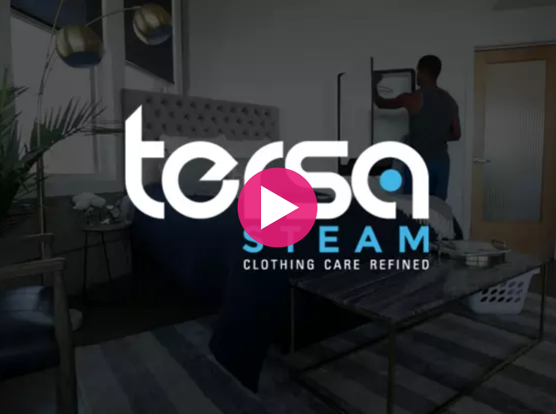
Sometimes a company is built for seamless branding. Our Boulder graphic design team got to dive head-first into the refined life on our recent work with Tersa Steam, a cutting-edge product that revolutionizes the way we clean and care for our clothing. At first glance, Tersa Steam appears to be an unassuming mirror or wall decor piece. Look closer, and you’ll see just how incredible it really is, and how it quickly refreshes and revitalizes clothing in a matter of minutes. It’s a movement everybody can get behind, except those who absolutely adore spending their free time doing laundry.
This was an exciting project from the jump. Firstly, the Tersa Steam is just plain cool. Not only does it bring us one step closer to living in what we thought “The Future” would be like when we were kids, it’s physical proof of the power of crowdsourcing.
Some smart dudes from St. Louis saw a problem, thought up a solution, tinkered a bit, threw it up on IndieGoGo, and boom. Tersa Steam lives. Now, people are spending less time in the laundry room and hampers are filling up at a much more reasonable pace. Truly, this is refined living.
Oblique helped Tersa develop their brand messaging, created their logo and tagline, an designed a stationary suite and a new IndieGoGo splash page that went live just in time for CES. The work we did was key in pushing Tersa to hit its crowdfunding goals, driving this extremely innovative product to market.
We wanted to make sure Tersa’s branding would jump out to the right people. We started with the foundations of Tersa’s message and tweaked it to speak to our core markets. Our goal was to spark intrigue with groups like Millennial and mid-market professionals, frequent business travelers, hospitality C-suite groups, hip work/live spaces, and college housing.
We wanted these groups to view Tersa as a product and brand that understands their desire to look, smell, and feel great fast, without cutting corners; to see Tersa not as a shortcut, but as a refined way to tackle one of life’s most frequent chores in today’s demanding career environment. With this in mind, our branding team arrived at the perfect tagline: Living Refined.
For the logo, our graphic design team wanted to capture the allure of the product itself while also hinting to consumers what Tersa Steam does. We accomplished this by alluding to water with blue and complementing it with black as a nod to the sleek design of the product itself. We designed the ‘e’ to look like an abstract timer to communicate the quick 10-minute process needed for Tersa Steam to revitalize clothes. Because this is such a new and cutting-edge product, we went with a modern sans-serif typeface that appears understated, but also conveys confidence. And really, confidence is what the Tersa Steam is all about. If you look good and smell good, you also feel good. It’s the transitive property of Tersa Steam.
The product is awesome. Its story is awesome. The guys who made it are awesome. Needless to say, we feel pretty awesome about the working with Tersa Steam. We hope you’ll check it out.

