Social addictions.
Nothing gets our inspiration flowing like a good, juicy blog post. Read about what we’ve been working on (our latest launches), what we can’t stop thinking about (design trends, industry happenings and new partnerships) and what we think you should know (expert branding insights and probably some stuff about dogs).
Check back often—we’re quite chatty when we want to be.
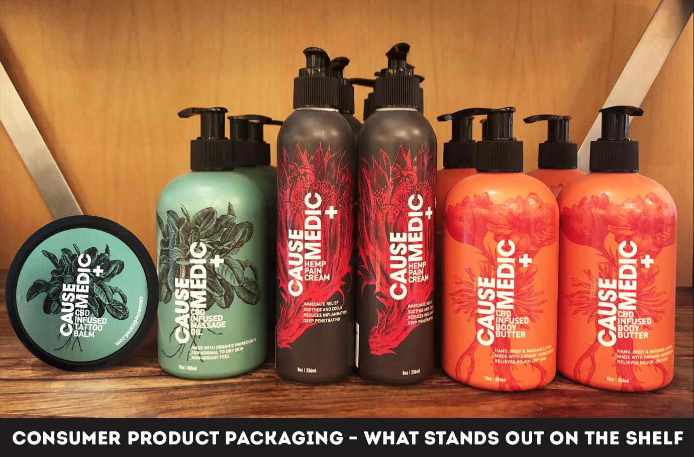
Consumer Product Packaging – What Stands Out on the Shelf
Picture this: you’re walking down the cereal aisle in a Target and you’re watching boxes of cereal fly by like you’re spinning the wheel on Wheel of Fortune. Suddenly, your eye stops wandering and it lands on a box that stands out against the rest. How did they do this? How can one creative packaging design stand out in a very competitive market? Well, we’ll give you a few pointers to help you through the design process.

Keep It Simple
First impressions matter. Your product packaging design plays a big role in creating that lasting impression. Keeping your packaging design simple yet striking will help bring it into focus. Some ways to do this are: using fewer colors, minimizing graphics, and using clear and intentional messaging. Sometimes, complex designs are overwhelming, especially if you have to pause and take a second to understand them. Chances are the average shopper is running low on time and patience, and complicated graphics and messaging confuse them no matter how high quality a product is. Remember, your design is supposed to directly convey everything about your brand as quickly and easily as possible.
Clarity is Key
Your packaging design should not leave your customers guessing about the purpose of your product. Your packaging design should succinctly explain the product’s usage and how that should be done. How creatively and clearly this is done will help you position your product within a market.
Be Intentional about Color Selection
There is an entire psychology called “Color Theory” based on the connection between color and human emotion. As such a connection exists, and because buyers typically make decisions based on an emotional connection to whatever they are looking to purchase, the color you choose for your product thus determines how it will be perceived and how it will be purchased. Be wary of how you choose the color scheme for your packaging design.
Images Have Power
There are probably hundreds of other companies/entrepreneurs selling the same product as you. Grabbing buyers’ attention can be a challenge, obviously, but sometimes using a beautiful image can help. Images have the power to convey messages without the hassle of finding the right words and using up prime space. Using an image that portrays the contents of your package can even manage consumers’ expectations of using your product. It helps match the customers’ imaginations with their realities. This is always a great and quick technique to help your package design stand out on shelves.
It’s OK to be Trendy
Don’t let your creative packaging design run stale on shelves for years at a time. If you are not striving to be relevant, someone else is. Take advantage of seasons, holidays, appropriate social causes, and global trends when you can. Don’t get left in the dust.
Retail is constantly evolving, and quickly at that. Product packaging design is difficult, but an experienced designer can help you find the sweet spot. Oblique Design has a lot of experience helping our clients find that sweet spot, and we can surely help you out too.
