Social addictions.
Nothing gets our inspiration flowing like a good, juicy blog post. Read about what we’ve been working on (our latest launches), what we can’t stop thinking about (design trends, industry happenings and new partnerships) and what we think you should know (expert branding insights and probably some stuff about dogs).
Check back often—we’re quite chatty when we want to be.
Aspen Mesh: Microservices Simplified

It’s springtime here in beautiful Boulder, and Team Oblique has been busy as a bee. After winning several projects at the tail end of last month, we’ve been hard at work cooking up some tasty new designs. Allow us to introduce you to one of our fabulous new clients, Aspen Mesh, who chose us among several Colorado design firms to revamp their brand with a bold new logo, custom stationery suite, and website overhaul.
Aspen Mesh provides a supported service mesh for managing microservices, so their users can spend less time worrying about infrastructure and more time working on code. They’re experts dedicated to the success of the businesses they work with, building trusted partnerships and solving problems before they even arise. Basically, if your business’s tech team needs a better way to manage microservices, Aspen Mesh has got your back!
We met with their team to conduct a brand strategy workshop, and identified several key values from which to build their voice. With these in mind, our goal was to pinpoint ways we could position Aspen Mesh as frontrunners in their field while preserving their laid-back attitude—not only do these guys really know their stuff, but they’re also awesome to work with. We wanted to convey that Aspen Mesh has the expertise to take the complexity out of microservice management, and is committed to building trusted partnerships with their customers.
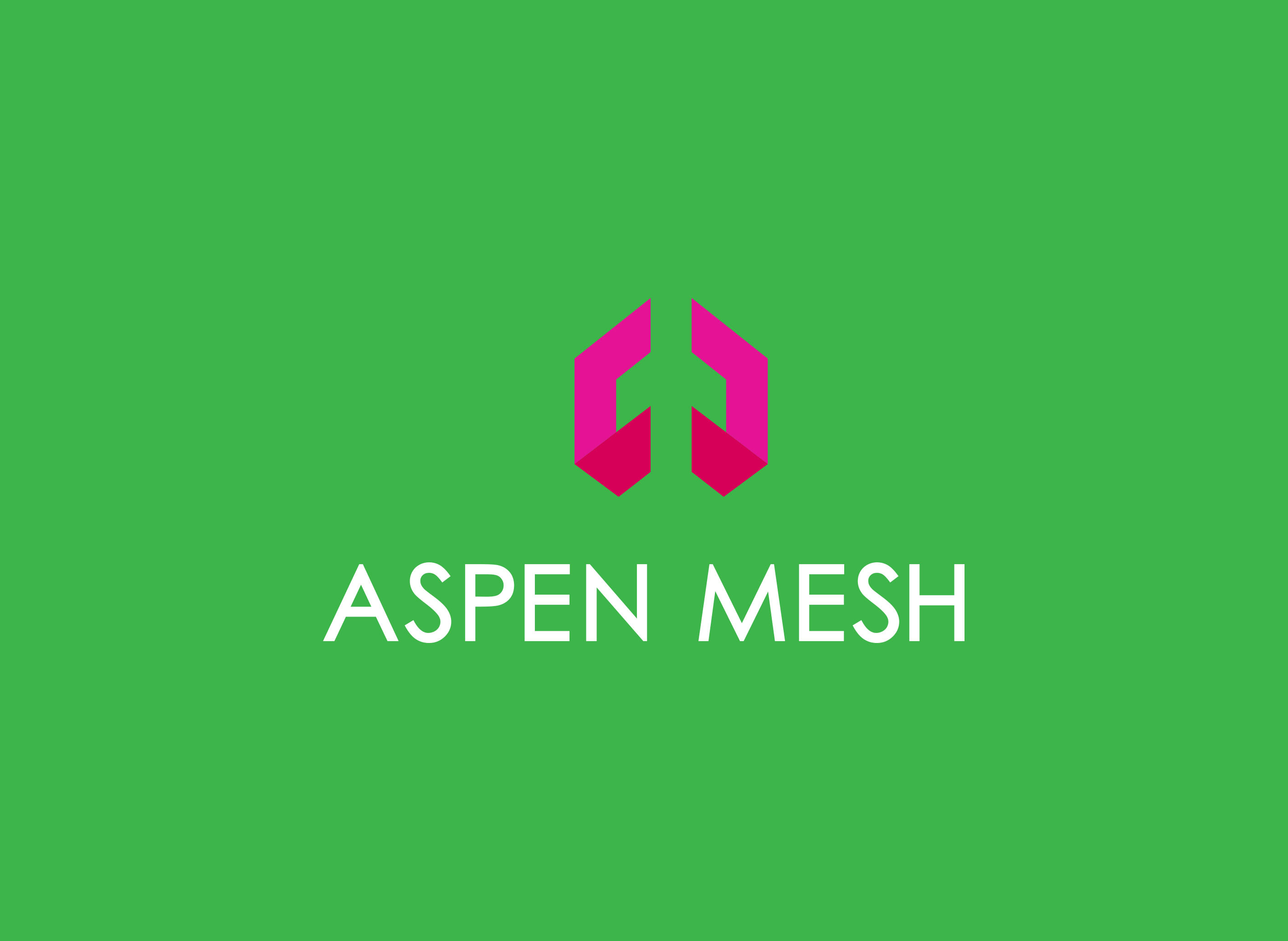
After reviewing a handful of creative design approaches, the client chose a logo with clean, angular lines and a simple sans serif font. We selected colors in hot magenta and bright green hues, evoking both innovation and playfulness at once. Our goal was for the simplicity of the design to underline both the services Aspen Mesh provides and the experience of working with them—that is to say, totally headache-free. We’re pleased with the outcome: a logo that’s versatile, visible, and engaging, without being overly complicated.
Next up, we’ll be diving head-first into work on the stationery suite and website redesign. Stay tuned!
