Social addictions.
Nothing gets our inspiration flowing like a good, juicy blog post. Read about what we’ve been working on (our latest launches), what we can’t stop thinking about (design trends, industry happenings and new partnerships) and what we think you should know (expert branding insights and probably some stuff about dogs).
Check back often—we’re quite chatty when we want to be.
Client Spotlight: Say Less Productions
Shannon Costello Düster started Say Less Productions after experiencing firsthand how the typical Hollywood production company can be exclusionary towards women and marginalized groups. Based in Boulder, Say Less Productions focuses on restorative justice, giving voices to those who would be ignored by the mainstream production community. Her production company focuses on telling the real stories of women in male dominated spaces, especially those in athletics.

Oblique Design is a women-owned Boulder design agency, so our values and experiences aligned with Shannon’s and we were excited to partner with her to create a brand identity that represents her vision and Say Less Production’s purpose in the film industry. We started the process by having an in-depth review of Shannon’s strategy, core values and mission. Then our Boulder design team created logo design options that stayed true to Shannon’s vision while also letting Say Less Productions stand out among competition.
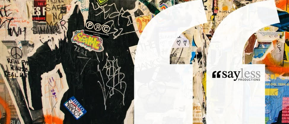
The final logo focuses on the brand identity, bringing forth attributes like being simultaneously minimalist and having subtle sophistication. Shannon wanted to express how you can say more…by saying less. This is the core nature of the marginalized women that Say Less Productions focuses on. Our logo design incorporates large quotation marks positioned next to a lower case wordmark reading “say less”. The quotation mark meets the letterforms at their x-height creating emphasis, denoting that the “say less” is not something that is simply read or written, it’s read with conviction. The typographic treatment is in all lowercase to further emphasize an approachable feeling of understanding and compassion. Finally the word “less” is a light grey which allows the “stay” in black to stand out.
We are currently in the process of designing a website, along with other marketing materials to provide her company the awareness it deserves. The entire team at our Boulder design agency was excited to get behind this client and help the organization grow and succeed.
