Social addictions.
Nothing gets our inspiration flowing like a good, juicy blog post. Read about what we’ve been working on (our latest launches), what we can’t stop thinking about (design trends, industry happenings and new partnerships) and what we think you should know (expert branding insights and probably some stuff about dogs).
Check back often—we’re quite chatty when we want to be.
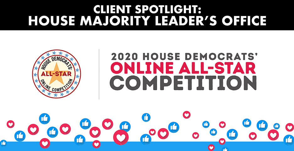
CLIENT SPOTLIGHT: House Majority Leader’s Office
We’re about to toot our own horn here! Beep beep.
Recently, we designed a logo and infographic for the House Democrats’ Member Online All-Star Competition. That’s right, we said THE HOUSE OF REPRESENTATIVES! We wanted the competition logo to stand out and denote a fun creative pursuit (gaining social media followers- the competition’s objective) and we were also tasked to design an infographic to display the competition winners for this year and all past years in a fun and engaging way; and we did so with pride!
The 11th annual competition among House Democrats, and hosted by Majority Leader Steny Hoyer, is a race to acquire the most new followers on social networks between July 8th and 28th. This was such an interesting opportunity for us to showcase our ability to balance being stately and playful. By incorporating the traditional colors and symbolic images of the US government, we were able to set up a framework for us to play around with brighter pops of color and whimsical graphics.
Getting involved and bringing a new slant to an established straight-laced environment really allowed us to flex our creative muscles. We ensured that both the logo and infographic were simple and striking in a way that was suitable for the brand of the House Democrats. We also made sure that the logo and infographic were appropriately clever and snuck in our subtle, signature Oblique edge. The target audience for this project were those in the Democratic House sphere, aka, suits. We wanted to spice up the government bubble and communicate the prestige of this modern social media era competition. We really pushed the envelope by delivering some fun concepts and letting our clients pull back to a final design to a point they were comfortable with.
Take a peek at our creative logo design and infographic!

You’ll see immediately how we incorporated this delicate balance. The logo denotes a government entity, made obvious by including red, white and blue. However, we were able to break out of this 250 year design color convention by thoughtfully highlighting the important facts in the infographic in a new color. We brought their message into the present.
We love creative logo design and playing around within established parameters. If you are thinking of redesigning your logo or need some fun new website graphics, email us and we’ll help you out.
