Social addictions.
Nothing gets our inspiration flowing like a good, juicy blog post. Read about what we’ve been working on (our latest launches), what we can’t stop thinking about (design trends, industry happenings and new partnerships) and what we think you should know (expert branding insights and probably some stuff about dogs).
Check back often—we’re quite chatty when we want to be.
Non-Profit Website Design: Reaching Out MBA
Calling all members of the LGBT+ community with graduate degrees looking for job placement!
We have an awesome opportunity for you to link with one of our amazing non-profit clients, Reaching Out.
Our relationship with Reaching Out began in a very competitive RFP process that we are so proud to have won. We partnered with Twisted Simple to create a non-profit site design on par with Reaching Out’s mission to provide a safe space for LGBT+ individuals to come together as a community and support each other while navigating the daunting job placement journey that accompanies attending MBA programs.

We are so grateful for the opportunity to not only work with such a talented group of people, but also to work with an organization whose values and vision we truly love. We wanted to align with an organization, like Reaching Out, that is focused on creating a positive social impact on the world. Together with Twisted Simple, we streamlined the overall look of Reaching Out’s site, modernizing it, making it more inviting and better representing who they are as an organization and what they want to accomplish. We also took a careful look at their user’s journey through the site and facilitated the improvement of their UI/UX.
It is widely known that the rainbow flag is the beacon of the LGBT+ community. We wanted to customize the look of the website for Reaching Out but also pay homage to the community it supports. If you take a peek at the website, you will notice how multi-colorful it is, yet the tones are different and simpler than the ones you see on the rainbow flag. We danced between minimalism and maximalism with the color scheme. We chose simple fonts and poignant imagery to create a very logical user journey throughout the website, as guided by its layouts. While we took charge of the look and feel of the site, our partner, Twisted Simple, took charge of the more technical aspects of web development. Working with an amazing partner really helped bring everything together for our successful nonprofit site design.
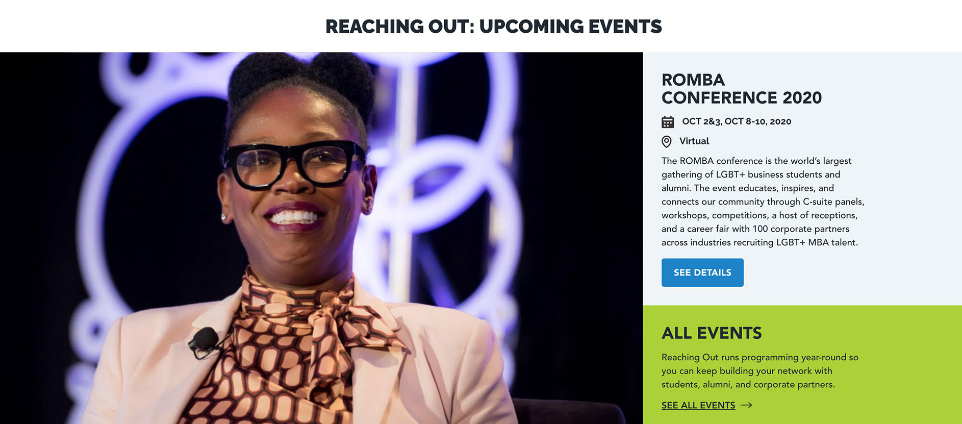
On Oct 2-3 and 8-10, 2020, Reaching Out is holding a virtual conference for LGBT+ business students and alumni. The virtual conference is designed to educate, inspire, and connect these communities through C-suite panels, workshops, competitions, receptions, and a career fair with 100 corporate partners across industries recruiting LGBT+ MBA talent. If this is something that you’d like to participate in, head over to their website to register!
If you too are a nonprofit looking to design or redesign your site, we’d love to hear from you. We are always looking to assist causes that light a fire within us. Get in touch to let us know about your upcoming project. We’re always happy to hear from non-profit organizations working for change.
