Social addictions.
Nothing gets our inspiration flowing like a good, juicy blog post. Read about what we’ve been working on (our latest launches), what we can’t stop thinking about (design trends, industry happenings and new partnerships) and what we think you should know (expert branding insights and probably some stuff about dogs).
Check back often—we’re quite chatty when we want to be.
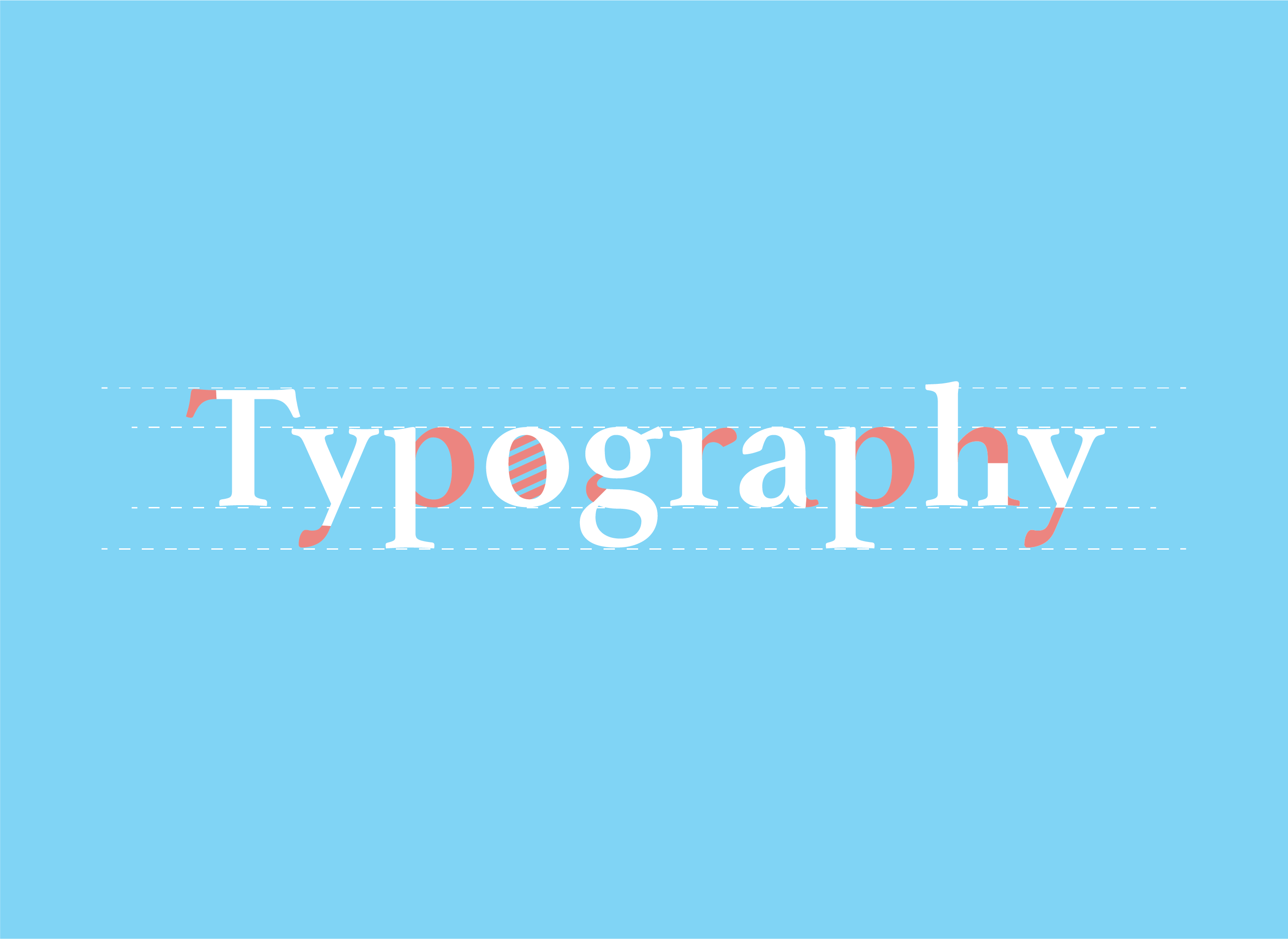
Let’s Talk About Text, Baby: Typography 101
Type is virtually everywhere these days: in books and magazines, on billboards and street signs—heck, even on shampoo bottles and the backs of cereal boxes—and that’s just in the physical world. If you’ve ever used a computer, or any electronic device for that matter (and if not, we’re both perplexed and impressed you’re reading this), you’ve seen type in action.
Design and advertising agency professionals use typefaces every day for a wide range of applications, from evoking emotions to enhancing the readability of text. In fact, typography is fundamental to what we do, and the right typeface can absolutely make the difference between a good design and a great design. Whether you’re new to the biz or brushing up on the basics, we hope this handy intro to typography will help you take your work to the next level.
Terminology
A quick vocab lesson before we get started:
type – printed (or digital) characters or letters
typography – the art of designing and arranging type
typeface – a particular design of type; e.g. Helvetica
font – the style of a particular typeface; e.g. 10 point Helvetica in bold
Thanks to computers, many people today use the terms typeface and font interchangeably. Some argue that maintaining the distinction is esoteric and old-fashioned, but professional designers really should understand the difference. Learn the rules before you break them, you know?
A Brief History of Typography
Since its invention in the 1400s (big ups to our main man Gutenberg), typography has undergone a number of stylistic transformations. Here’s how it all went down.
1400s – Johannes Gutenberg invented movable type, as well as blackletter (Gothic), the first typeface. Prior to this, the written word was hand-lettered and not widely available. Blackletter wasn’t very legible, however, and by the end of the century, the more readable roman type had become the preferred typeface in Europe.
1500s – Italics were invented to save printers money by fitting more letters on a page.
1700s – By straightening the serifs and adding contrast between fine and bold letter strokes, William Caslon set a new standard for type, now known as Old Style. John Baskerville built off this and created what we now call Transitional style type, which is slightly more exaggerated. Following the trend, Firmin Didot and Giambattista Bodoni designed the first Modern typefaces, with even sharper serifs and more dramatic contrast.
1800s – William Caslon IV created the first sans serif typeface.
1900s – The 20th century brought the arrival of many beloved typefaces, such as those designed by Frederic Goudy (creator of Goudy Old Style) and Max Miedinger (Helvetica). With the increased popularity of computers came an explosion of typeface designs, including script and decorative varieties, leading to the immense collection we enjoy today.
(If you’re still hungry for history, this awesome stop-motion animation fills in some of the gaps.)
Serif vs. Sans Serif
The difference between serif and sans serif typefaces isn’t complicated. Basically, serif typefaces have little feet on the edges of letters, while sans serif typefaces do not.
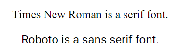
Serif typefaces are traditional and conservative, which makes them a good choice when a design needs to look serious, timeless, or classy. They’re also usually better for printed work, such as the body copy of a book or magazine, than sans serif typefaces.
Sans serifs, on the other hand, are modern and simple, making them highly versatile. Sans serif typefaces are frequently used in online body copy, as they’re more readable than serif typefaces at lower resolutions and smaller sizes.
Choosing the Right Fonts
Whether online or off, most of the fonts we encounter are carefully selected for their unique qualities. Speaking from experience in the design industry, choosing the right font is as critical to your success as choosing the right color palette. Like colors, typefaces have their own personalities, tones, and moods.
In most cases, clients come to designers with a vision and little to no technical knowledge. They often want their brands to include abstract concepts such as trustworthiness, playfulness, or ingenuity. It’s our job to translate these ideas into concrete, visual representations that not only embody what the client wants, but convey their values to others.
Typography is an art, so the creative choices we make are subject to our own artistic vision, preferences, influences, and instincts. But, just like any art, there are certain rules to remember before you go mixing typefaces all willy-nilly.
- Type is inherently emotional. Different typefaces suit different moods and are useful in different settings. You wouldn’t use a fun, quirky font as the header for a funeral announcement, for example.
- Readability is important. Don’t distract people with excessively complex typefaces.
- Typefaces pair well when they share some essential trait. Pay attention to the way they compare and contrast with one another.
- Don’t mix too many typefaces—two is enough, and three is for experts only. Ever seen a menu with a bunch of different typefaces all mashed together? Not cute.
- Some typefaces should be locked in a metal box and then catapulted into the sea, never to be used again. Comic Sans, Papyrus, and Bradley Hand are on the short list.
#/media/File:Papyrus_Font.svg)
This concludes Oblique Design Academy’s Typography 101 course. With these fundamentals under your belt, you’re well on your way to cultivating some killer typography skills. Class dismissed!