Social addictions.
Nothing gets our inspiration flowing like a good, juicy blog post. Read about what we’ve been working on (our latest launches), what we can’t stop thinking about (design trends, industry happenings and new partnerships) and what we think you should know (expert branding insights and probably some stuff about dogs).
Check back often—we’re quite chatty when we want to be.
Weighing the Pro’s and Con’s of Hamburger Navigation
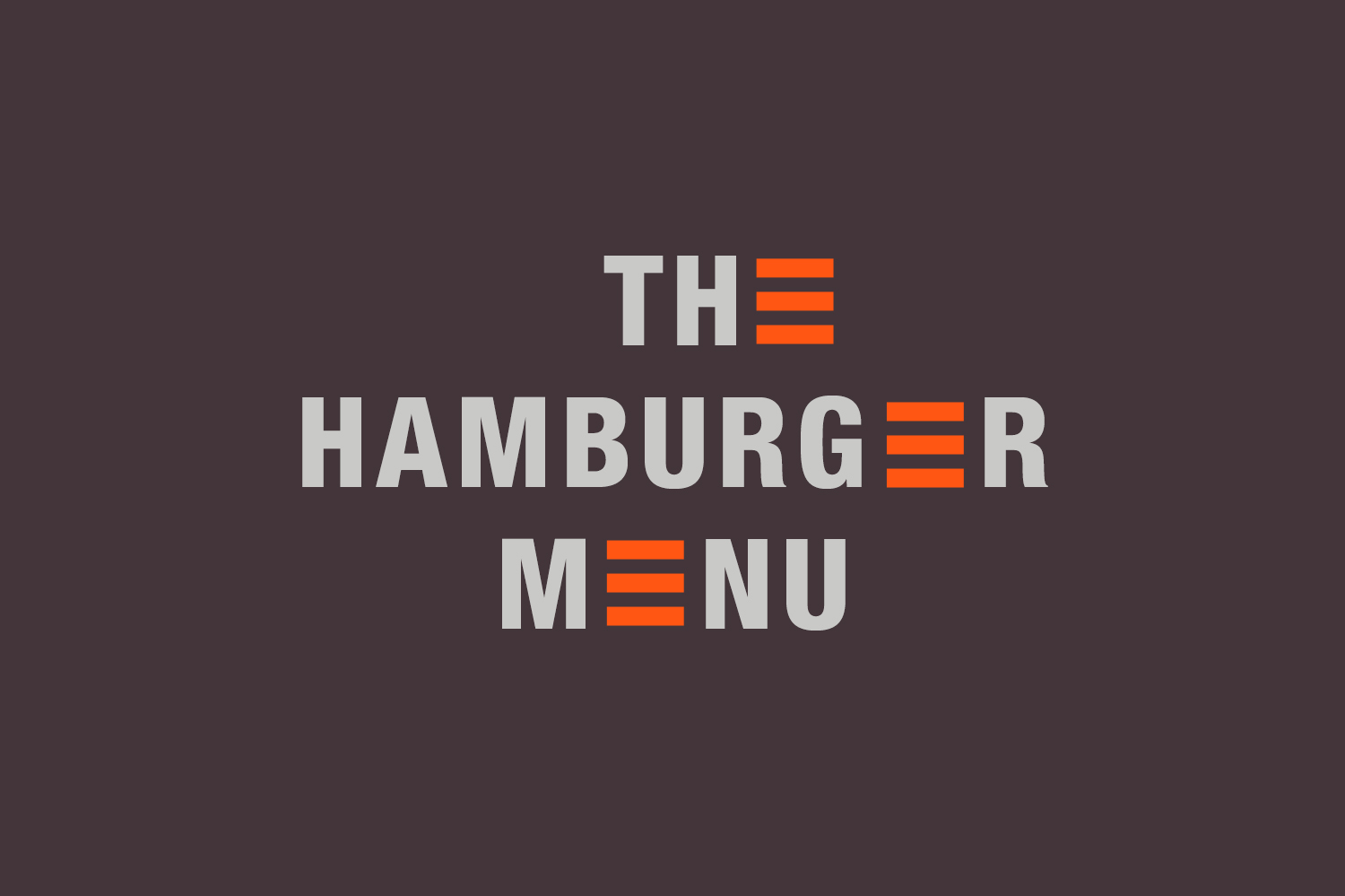
No, we’re not talking about the McDonald’s kind of hamburger. You might not have heard of a hamburger menu before in the context of interactive web design, but you’ve almost certainly used one. The three-line symbol that you often see in the upper right or upper left of a website has come to be known in website design as the “hamburger menu” is now almost universally recognized as a navigation menu.
A hamburger menu is really a method of hiding your navigation for clean website design. It was once reserved for small screens and apps, where space was limited, but has recently made the leap onto desktop sites. Hidden navigation is trending in website design, and even Beyonce is a fan.
A lot has been written and studied about the hamburger menu. Generally speaking, UI/UX experts aren’t impressed at it’s performance. When it comes to finding your site menu, it turns out users are looking for the word ‘menu.’ In tests, users are much more likely to click on the word ‘menu,’ or at least on hamburger navigation paired with the word ‘menu.’
But that doesn’t mean that there’s no place for a hamburger menu on a desktop screen. When it comes to simplicity, no other navigation design compares. If your homepage is centered around visual or interactive content, hamburger navigation offers a solution that’s functional without being distracting. A conceptual home page for a younger target market begs for strong visual content that has them diving in for more – and a hamburger menu can get them there.
Hamburger navigation creates extra real estate, too. By hiding your navigation using a hamburger icon, you buy yourself extra pixels when the menu expands. Some sites (like that of our current advertising agency crush Brave People) use the entire browser window for the navigation, creating what is almost a two-part home page. Your menu items don’t have to be the only content in your hidden navigation; you can engage with social media icons, copy, photography or video. More information, less cluster.
That said, there’s plenty of reasons hamburger navigation might not be right for your brand. Bottom line, no matter how trendy or sleek it is, a hidden navigation means more clicks. And, although it’s recognizable, hamburger navigation doesn’t fare well in user testing. If the goal of your website is to provide important information quickly and without fluff, a readily seen navigation will make more sense.
If you’re digging the perks of a hidden navigation but are unsure about the actual hamburger symbol itself, there are other ways to hide it. Pardon our french, but the film Le Linge Rouge beautifully hides their navigation behind their own logo atop the word “menu.” The result is a homepage that’s captivating yet functional. It is perfect for a film, where content is king but the audience might not be tech savvy enough to appreciate a hamburger navigation symbol.
Here at Oblique Design, we’re all about daring, innovative design. But, when it comes to websites, the most important thing is that the user gets from point A to point B without a headache. We are always mindful of how a user will explore a website. For us; as a Colorado interactive design company, a website can look superb, but it has to work even better.
A hamburger menu on desktop screens allow a brand’s content to shine. But, when it comes to the most user friendly website design, nothing gets the job done like a traditional website navigation bar.