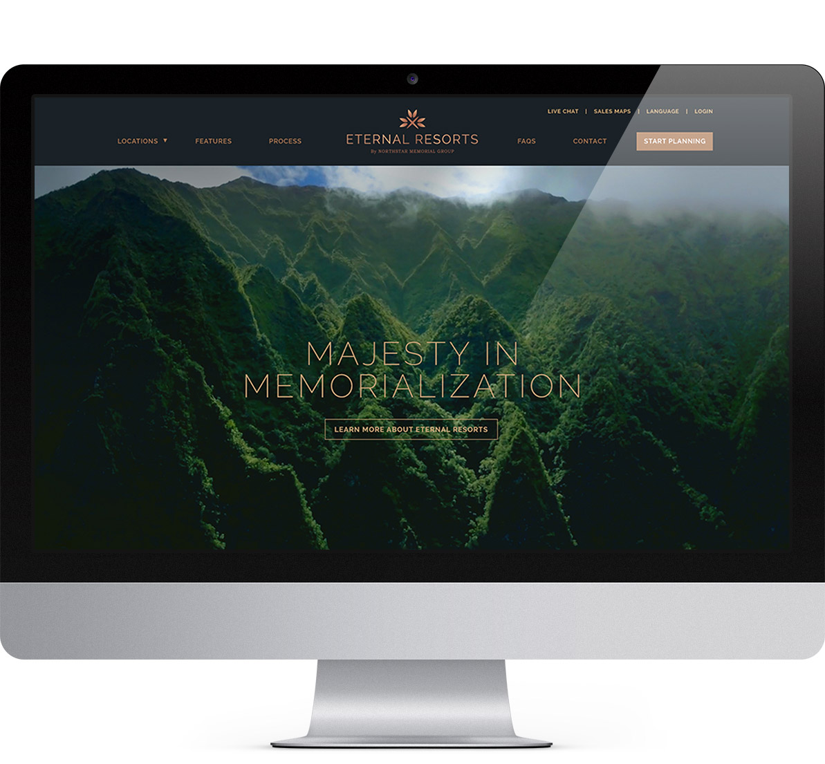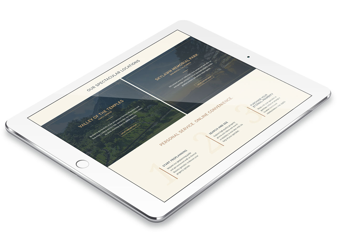
Get a glance of the goods.
Eye-catching design runs through our veins and impactful brand communications are what fuel our fire. Whether it’s crafting a new logo, building a dynamic website, designing eye-catching packaging, or creating compelling print materials, we’ve got you covered.
While we could go on about each project, we’d rather let our work speak for itself. Explore our portfolio to see our latest and most impressive creations firsthand.
Eternal Resorts
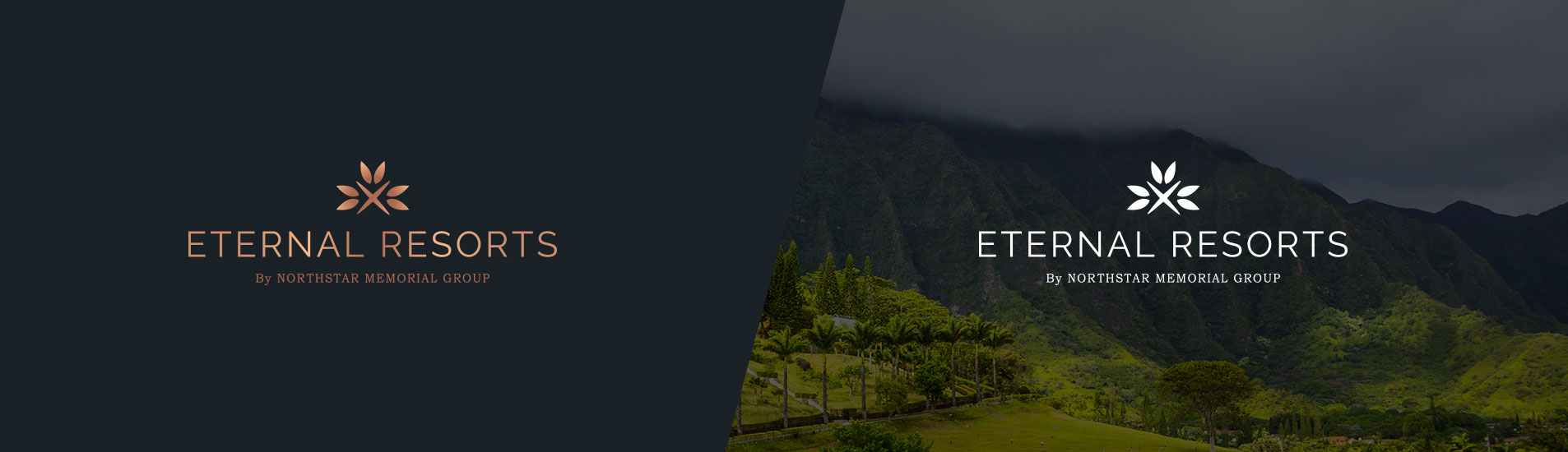
When we tell people that we do work for clients in the death care industry, we’re always met with looks of wonder. Then we show them the Eternal Resorts logo and watch their eyes light up. We designed this elegant logo and color palette to honor and respect those that have passed. This “X” in the center of the icon and the over-simplified leaves shows that Eternal Resorts is a resting place that will have an everlasting impact. The copper gradient was the color palette of choice to demonstrate prestige, unity and harmony.
Visit the site.